

A landing page headline has one job before anything else: help visitors recognize that they’re in the right place and understand why the offer matters. The common landing page mistakes to avoid include vague headlines, unclear calls to action, slow page speed, broad audience targeting, and a mismatch between the ad and the page.
It’s easy to focus on design and overlook the message that brought someone to a landing page. When an ad promises one thing but the page leads with another, visitors may hesitate instead of taking the next step. A strong headline addresses the intended audience, explains the offer, and clearly matches the campaign.
This guide explains how to align those messages and improve calls to action, mobile usability, and page focus. You’ll learn what to review and how to make practical changes that give visitors a clearer path from clicking an ad to responding to your offer.
Key Takeaways
- Make your headline quickly explain who the offer is for and why it matters.
- Use a clear call to action that tells visitors what happens next.
- Keep the page focused on one audience and one primary conversion goal.
- Improve mobile usability and page speed by reviewing images, scripts, and layout.
- Align the landing page headline and offer with the ad that brought visitors there.
1. Image, script, hosting, and mobile optimization
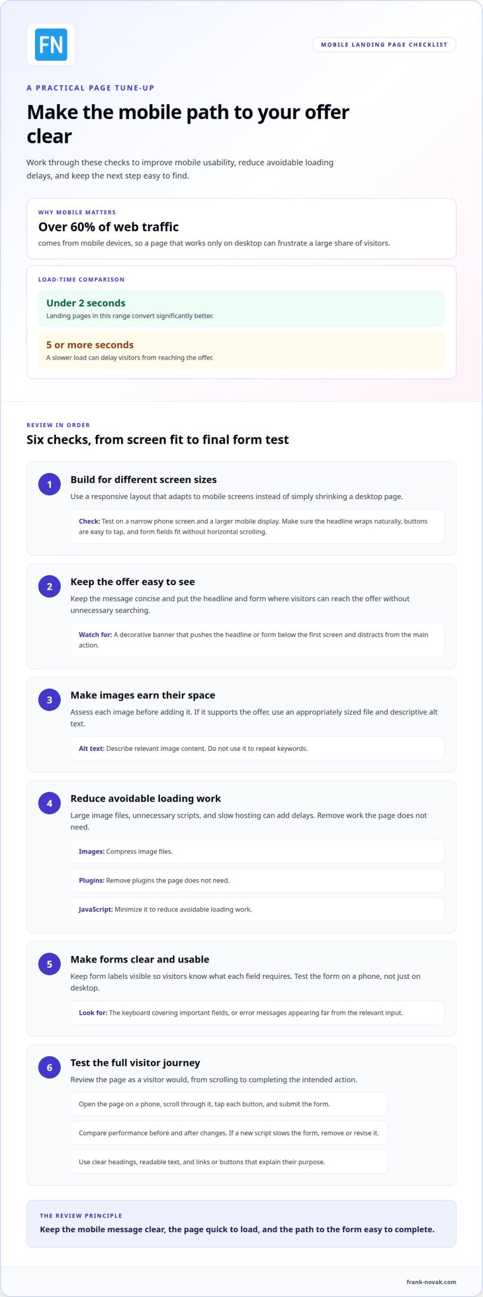
What are landing page best practices for mobile users? Keep the message concise, make forms easy to complete, and ensure the page loads quickly. Since mobile devices account for over 60% of web traffic, a page that works only on a desktop can frustrate a large share of visitors.
Build responsive landing pages that adapt to different screen sizes rather than simply shrinking a desktop layout. Test the page on a narrow phone screen and a larger mobile display. Check that the headline wraps naturally, buttons are easy to tap, and form fields fit without horizontal scrolling. These details make the page easier to use and keep the conversion goal within reach.
Page speed also affects whether mobile visitors reach the offer. Landing pages that load in under 2 seconds convert significantly better than those taking 5 or more seconds. Large image files, unnecessary scripts, and slow hosting can add delays. Compress images, remove plugins the page doesn’t need, and minimize JavaScript to reduce avoidable loading work.
Assess each image before adding it. A decorative banner that pushes the headline or form below the first screen can distract from the main action. If an image supports the offer, use an appropriately sized file and descriptive alt text. The alt text should explain relevant image content, not repeat keywords.
How should landing pages be optimized for accessibility and SEO? Use descriptive alt text for meaningful images, clear headings, readable text, and links or buttons that explain their purpose. These practices help visitors understand the page and give search engines useful context. Keep form labels visible so visitors know what each field requires.
Review mobile usability as a visitor would. Open the page on a phone, scroll through it, tap each button, and submit the form. Check that the keyboard doesn’t cover important fields and that error messages appear beside the relevant input. A form that works well on desktop may be difficult to complete on a small screen.
Compare page performance before and after changes. If compressed images improve loading but a new script slows the form, remove or revise the script. This review helps uncover common landing page mistakes to avoid, from distracting visuals to technical additions that make the next step harder.
2. Writing and styling effective calls to action
A call to action should make the visitor’s next step unmistakable. Place the main message, value proposition, and primary action near the top of the page so visitors can understand the offer and respond without searching. For example, a page offering a downloadable guide could explain what it helps with and use a button labeled “Get the guide.”
Use action-focused wording that describes the step or outcome instead of a vague label. “Submit” tells visitors little, while “Request a consultation” makes the action clear. Button text should match what happens after the click. If it opens a form, say so; if it starts a purchase, describe that step accurately.
Connect the call to action to the value proposition. A strong value proposition explains what visitors receive and why it may matter to them. The button turns that promise into a clear next step. For instance, pair “Plan your next launch with a practical checklist” with “Download the checklist.” This keeps the message focused and sets a clear expectation.
Style the primary action so it stands out without competing with the headline or supporting details. Contrast the button with its background and leave enough space around it to distinguish it from nearby links. Keep its appearance consistent when the same action appears again. If buttons use different colors and labels, visitors may struggle to identify the intended path.
Place the main call to action near the top, after the value proposition, and repeat it at the end after visitors have seen the supporting information. On a longer page, a repeated button gives readers another clear route forward without making them scroll back. Make sure every button supports the same conversion goal.
Before publishing, test the full action sequence. Click the button, confirm where it leads, and complete the form or purchase steps as a visitor would. Check that the confirmation screen matches the promise beside the button. If “Get the guide” leads to an unrelated page, that mismatch can weaken trust and disrupt the user journey.
Review the page’s calls to action as a connected message, not isolated design elements. A focused headline, clear value proposition, and specific button help visitors understand both the offer and the next step. For practical guidance on building an online business, explore online success resources.
3. Creating landing pages for specific audiences and conversion goals
A focused landing page serves one audience and one primary conversion goal. If an ad targets first-time business owners, the page should address their needs rather than mixing beginner guidance with advanced strategies. A dedicated page gives visitors a relevant path from the campaign message to the intended action.
Adding another conversion goal can compete with the main action. A page that asks visitors to book a call, download a guide, and buy a product gives them several directions at once. Adding a second conversion goal can reduce conversions by as much as 266%. Keep one primary action prominent, then remove links or prompts that pull attention elsewhere.
Page speed can affect whether visitors complete that action. A slow transition from the ad to the offer may interrupt the journey before visitors understand the page. If it feels sluggish, review image sizes, scripts, and hosting, then test the form and buttons after making changes. A fast, functional path helps maintain the momentum that brought visitors to the page.
Reduce friction by asking only for information that supports the conversion goal. What landing page form fields reduce conversions, and how many should you use? Fields unrelated to the offer can make completion feel like extra work, so request only essential details. There’s no universal field count, and shorter forms don’t always perform better.
One test illustrates why form changes need context: reducing a lead-capture form from nine fields to six decreased conversions by 14%. That result doesn’t mean longer forms are always better. Instead, consider what each field helps you do next. If a phone number isn’t necessary for delivering a download, remove it; if a consultation requires context, ask only for details that help prepare for it.
Multiple paths can work when they support the same goal. For example, a lead-generation page might let visitors submit a form or select a relevant topic before completing it. Both routes should lead toward the same conversion, not introduce unrelated offers. Label each option clearly so visitors know what happens next.
Match the page to the audience’s situation. Someone who clicks an ad for a beginner guide should quickly find its purpose, benefits, and next step, not have to search through general company information. Keep navigation simple, make the conversion goal visible, and remove competing prompts. This alignment makes the page easier to understand and helps prevent common landing page mistakes to avoid.
4. Improving hierarchy, load speed, imagery, and A/B testing
Visitors form an initial impression of a website in 50 milliseconds, so the first screen needs a clear visual order. Give the headline the strongest emphasis, follow it with concise supporting text, then make the primary action easy to spot. If every element uses the same size, color, or weight, visitors have little guidance about where to look first.
A simple layout helps people scan instead of forcing them to read every line. Only 16% of website visitors read every word, so use short paragraphs, descriptive subheadings, and spacing to separate ideas. For example, place a benefit statement near the headline and supporting details beneath it. Keep the most useful information visible before secondary explanations.
Clutter can come from more than text. Navigation menus, footer links, extra buttons, badges, and decorative elements can compete with the page’s main purpose. Landing page navigation and footer distractions can reduce conversion rates by up to 26%. Remove links that lead visitors away from the intended action, and keep any remaining navigation simple and relevant.
Loading speed shapes the experience before visitors can assess the offer. As page load time increases from one second to three seconds, the probability of a website bounce increases by 32%. Compress large files, remove unnecessary plugins, minimize JavaScript, and review hosting performance. Then load the page on a phone and desktop to see whether delays affect the first screen or later content.
Use imagery to clarify the offer, not to fill every open space. A relevant product image or simple process diagram can show visitors what they’ll receive. A generic stock image may add little context, while a large decorative image can push the headline down. Add descriptive alt text to meaningful images and keep text readable over backgrounds.
A/B testing helps isolate which page elements support the conversion goal. Change one element at a time, such as the headline, button wording, or image placement. Keep the other elements stable so the results point toward a useful explanation. A 200-visitor test may not provide reliable evidence of a difference, so avoid treating a small sample as a firm conclusion.
Before running a test, decide what action counts as a conversion and compare the same outcome for each version. Aim for a 90-95% confidence level when interpreting A/B test results. If a page has limited traffic, make one thoughtful improvement, then collect more evidence before changing several elements. This measured approach helps teams learn which visual choices make the page clearer.
5. Matching ad copy to landing page messaging
Every click creates an expectation. If an ad promises a beginner’s guide, the landing page should open with that guide, not a broad company introduction. Matching the message helps visitors recognize the offer and know they’ve reached the right destination. Keep the ad’s central promise visible in the page headline and opening copy.
Start with the campaign’s specific promise. Note the audience, offer, and action in the ad, then carry those ideas onto the landing page. For example, if a search ad promotes a guide to planning an online course, the page headline should name the guide or its outcome. A generic headline such as “Grow your business” breaks that connection.
Matching doesn’t mean copying every word mechanically. Preserve the meaning, tone, and useful details. If an ad emphasizes a free checklist, the page should present it clearly and explain what it helps visitors do. If the page introduces a different offer, visitors may wonder whether the campaign changed or the click led them somewhere unexpected.
Before launching a campaign, compare the ad headline, landing page headline, offer description, and call to action. Check that they refer to the same audience and outcome. Then follow the journey from ad to page as a new visitor would. A mismatch in any of these elements can break continuity, even when each piece works on its own.
Keep campaign-specific pages aligned with their traffic sources. A paid search ad, email promotion, and social post may promote the same product while highlighting different benefits. If an email emphasizes saving time, explain that benefit near the top of its destination page. If a social post focuses on a particular feature, make that feature easy to find.
Consistency also applies to the details behind the promise. Make sure the page’s offer, eligibility language, and next action match the ad. For example, don’t describe a resource as a downloadable guide in the ad, then send visitors to a page that appears to require a consultation. Clear continuity supports trust and provides a direct route to conversion.
When reviewing campaign performance, compare each ad’s message with its destination before changing the creative. If clicks arrive but conversions remain low, look for gaps in the headline, offer, and page content. This helps distinguish a weak campaign message from a landing page that fails to carry the promise forward. Consistent marketing connects each impression, click, and page interaction.
Frank Novak
Frank Novak’s Online Success Coaching can help if you want to apply these landing page principles to your broader online business efforts. If you’re working out how your campaign, offer, and page fit together, coaching can help you develop your approach. Never Succeed Online is another resource for readers building their online business knowledge.
These offerings are most useful when you’re ready to move from identifying page issues to considering your next steps. Pinpoint which areas need attention, such as the audience, campaign message, or conversion goal, and bring that focus to your coaching.
Build a Clearer Path Forward
Improving a landing page is an ongoing part of building an online business. Treat each revision as an opportunity to make the experience more useful for the people you want to reach. A thoughtful change can clarify your offer and make it easier for visitors to decide what to do.
Choose the area that matters most to your current campaign and make a purposeful improvement. As you learn more about your audience, revisit the page and adjust its message or structure to better fit their needs. This steady process helps you address common landing page mistakes to avoid while keeping the page’s purpose in focus.
For support connecting your landing page to your wider online goals, explore Frank Novak’s Online Success Coaching, ClickBank Super Funnel, or Never Succeed Online. Choose the option that fits your next step and get in touch to discuss your goals.
You can keep moving forward one considered improvement at a time.
Frequently Asked Questions
What makes a strong landing page headline?
A strong headline identifies the intended audience, names the offer, and gives visitors a reason to keep reading. For example, “A beginner’s guide to planning your first online course” is more specific than “Build your future.” Make sure the headline accurately reflects the offer below it. If the ad or email makes a particular promise, carry it into the headline without overstating what the page provides.
What are the most common landing page mistakes?
Common problems include a headline that doesn’t explain the offer, a page aimed at several audiences, and competing calls to action. Visitors may also leave if an ad promises a guide but the destination emphasizes a different offer. Review the page from their perspective: does the first screen match the campaign, is the next action clear, and does the form request information that supports it?
How does slow landing page load time affect conversion rates?
A slow page can interrupt a visitor’s intent before the offer or form appears. This is especially important after an ad click, when visitors expect the destination to continue the same conversation. Test the page on mobile and desktop, then review large assets, scripts, and hosting to diagnose delays. Track loading performance alongside form starts and completed actions to see where visitors drop out.
How many calls to action should a landing page have?
Choose one primary conversion action, such as requesting a guide or starting a purchase. You can repeat that action in different parts of the page as long as each button leads to the same next step. For example, a longer page can show “Download the guide” near the beginning and again after the details. Avoid unrelated choices that divide attention between separate goals.
How can confusing headlines and unclear value propositions hurt landing page conversions?
When visitors can’t tell what an offer is or why it matters, they have to interpret the page before deciding whether to act. That uncertainty can weaken the connection between a campaign and its destination. Replace broad claims such as “Reach your potential” with a clear description of the offer and its intended audience. Then explain the benefit in terms visitors can recognize.
How do trust signals, testimonials, and security badges affect landing page performance?
Trust signals can help visitors assess whether an offer is credible, but they should be specific and genuine. Use a real testimonial that describes someone’s experience rather than a vague statement without context. A security badge should accurately represent the page’s security arrangements. Leave out any claim or badge you can’t support; unsupported reassurance may create doubt rather than confidence.
What are common landing page design mistakes that increase bounce rates?
Design problems include competing visual elements, hard-to-read text, intrusive pop-ups, and navigation that leads visitors away from the offer. On mobile, horizontal scrolling or buttons obscured by other elements can make the page difficult to use. Review the page at different screen sizes and follow the route from headline to action. Remove anything that blocks that route or distracts from the page’s purpose.
How can A/B testing identify and fix landing page problems?
A/B testing compares two page versions to see whether a specific change affects the intended action. Start with a clear hypothesis, such as whether a more descriptive headline helps visitors understand the offer. Change one element while keeping the rest consistent, then compare the same conversion measure for both versions. Record the change and result so future decisions build on a clear test, not guesswork.

Article by
Frank Novak
Frank Novak is an online marketing professional and coach who focuses on affiliate marketing and business automation. Through his website, frank-novak.com, he shares insights and strategies for leveraging social media platforms like Facebook to generate traffic and commissions.
Affiliate / Sponsored Content Disclaimer
This [website/post] contains affiliate links. If you click through and make a purchase, we may receive a commission at no additional cost to you. We only recommend products or services we believe will add value to our readers.