

The most effective Facebook ad image isn’t necessarily the most elaborate. It’s the one that makes the message clear at a glance. Creating Facebook ad images that stop the scroll means matching the visual to a specific audience, giving it one clear focal point, and making sure the image or video works with the rest of the ad.
If you’re choosing between a bold design, a natural-looking photo, or a short video, you’re not alone. The creative needs to earn attention while helping people understand what you’re offering. Each visual choice should support the message, not compete with it.
This guide covers five practical ways to strengthen Facebook ad creative: tailor content to your audience, focus the visual, study effective examples, use in-feed ad components thoughtfully, and choose the right image or video format. Whether you’re building your first ad or refining an existing one, these steps can help you make more deliberate creative choices.
Key Takeaways
- Address a clearly defined audience and test different opening lines to find which message earns attention.
- Give each creative one visual focal point so the main idea is easy to recognize in the feed.
- Study effective ads for how their visuals, message, and call to action work together, then adapt the approach to your offer.
- Plan primary text, headline, description, media, and button as connected parts of the ad, not separate details.
- Choose image, video, carousel, or flexible creative based on how you want to present the message and invite people to engage.
1. Audience-specific ad content
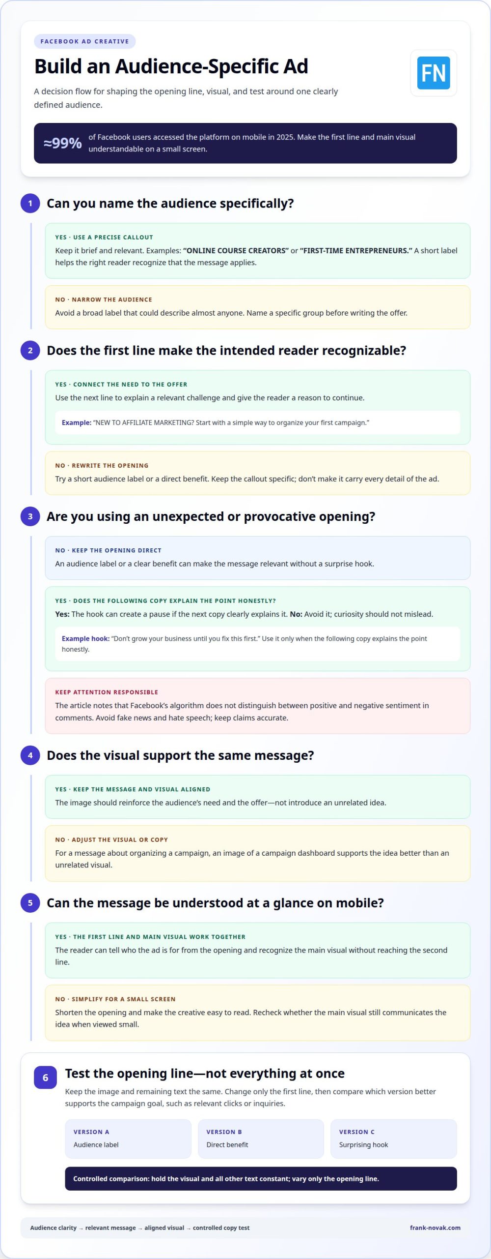
A Facebook ad should make its intended audience recognizable before readers reach the second line. Start by naming a specific group, then connect its needs to one clear offer. For example, an ad for beginner affiliate marketers could open with “NEW TO AFFILIATE MARKETING?” instead of a broad line about growing a business. That callout helps the right reader decide whether the message applies.
All caps can make the opening callout stand out, but it works best when the words identify a real audience. Keep the phrase brief and relevant, such as “ONLINE COURSE CREATORS” or “FIRST-TIME ENTREPRENEURS.” Avoid capitalizing the entire ad. A short label is easier to scan and leaves room for the benefit that follows.
Next, connect the audience to a specific challenge. An ad for new affiliate marketers might say, “NEW TO AFFILIATE MARKETING? Start with a simple way to organize your first campaign.” The first sentence identifies the reader; the next gives them a reason to continue. Keep the visual and copy aligned, so an image of a campaign dashboard supports the message instead of introducing an unrelated idea.
Mobile viewing should shape those choices. Almost 99% of Facebook users accessed the platform on mobile in 2025. That makes short opening lines and easy-to-read creative practical considerations. If a person sees only the first line and the main visual on a small screen, both should still communicate who the ad is for.
An unexpected opening can also draw attention, especially when it challenges a familiar goal. For example, “Don’t grow your business until you fix this first” creates a pause by reversing an expected message. Use this approach only when the following copy explains the point honestly. Provocation should make the audience curious, not mislead them.
Comments can draw attention, but they need responsible handling. Facebook’s algorithm does not distinguish between positive and negative sentiment in comments. That doesn’t make outrage a sound strategy: avoid fake news and hate speech, and keep claims accurate. Useful discussion starts with a relevant point, not a false or inflammatory statement.
Finally, test audience messaging with a controlled copy change. Keep the image and remaining text the same, then change only the first line. Compare which version better supports the campaign’s goal, such as attracting relevant clicks or inquiries. This makes the opening line the variable, helping you learn whether an audience label, direct benefit, or surprising hook fits best.
Use all caps to call out the intended audience in the first line of a Facebook ad. Treat the callout as a precise label, not a substitute for the message: readers should be able to tell who the offer is meant for.
Choose wording that fits the audience addressed in the rest of the ad, and avoid broad labels that could describe almost anyone. Once readers recognize the intended audience, the next line can explain the relevant offer without making the opening carry every detail.
2. Choosing a single visual focal point
A Facebook ad image has little time to communicate its main idea. Choose one focal point, such as a product, a person, or a clear action. For a meal-planning app, show a prepared meal or an easy-to-read weekly plan, rather than making both compete equally. Viewers should recognize the subject before noticing decorative details.
Start by describing the image’s purpose in one short sentence. For example: “Show how this planner makes weekday meals easier.” Then choose the object or moment that demonstrates that idea. To introduce a product, feature it prominently. To show a benefit, use a scene that makes it clear, such as a completed schedule beside a busy calendar.
Next, remove elements that don’t support the image’s purpose. A promotional graphic might include a product, several badges, a discount, a logo, and multiple lines of text. Together, those details can compete for attention. Keep the product and one supporting detail, such as a single benefit label. Put secondary explanations in the ad copy, where they add context without crowding the visual.
Use scale and placement to establish priority. Make the main subject larger or brighter than background objects, and leave enough open space around it. For example, a coffee maker ad could center the machine with one cup nearby. A counter full of dishes, appliances, and ingredients may tell a broader story, but it can make the product harder to identify at a glance.
Color can guide the eye, too. Set the focal point apart from its surroundings, such as with a bright yellow object against a muted background. Contrast should distinguish the subject, not create another competing feature. If a colored headline, decorative shape, and product all demand equal attention, simplify until one element leads.
Check the design at the size people are likely to see in their feed. Reduce it on screen and ask whether the main object remains recognizable. If a headline becomes unreadable or a product blends into the background, adjust the composition instead of adding more detail. A clear visual idea can work in a square crop or taller placement when the subject stays prominent.
For a final review, identify the first thing your eye notices, then compare it with the ad’s intended message. If those answers differ, remove or reposition the distraction. This simple check helps keep the image focused while leaving room for supporting copy. For more practical online marketing guidance, connect each creative choice to the action you want viewers to take.
3. Examples of effective Facebook ads
Effective examples show how a creative connects its visual to a clear promise. Consider a neighborhood bakery promoting a weekend pastry box. A close-up establishes the product, while concise copy explains what the box includes. The image, offer, and next step all support the same idea.
A strong example doesn’t need a polished studio scene. A personal-profile-style photo can resemble an ordinary feed post and feel familiar in its surroundings. For a gardening workshop, that might mean showing a participant holding a finished planter. The image provides context, while the ad copy explains who the workshop suits and how to learn more.
People or animals can also give an image a clear point of interest. A dog-walking service, for instance, could show a walker and dog outdoors rather than a generic landscape. A photo of someone using a product can show its role in everyday life. Consider whether the human moment supports the offer, not just whether it looks appealing.
To test Facebook ad images, change one creative element at a time while keeping the audience, copy, and placement consistent. Compare results with the campaign’s goal, such as link clicks for traffic or completed purchases for sales. Use the stronger result to guide the next test.
For example, a language-learning course could test an image led by a tutor against one showing a lesson screen. Keep the headline and primary text unchanged, then compare relevant campaign results. If the tutor image earns more attention but fewer sign-ups, clicks alone don’t show which creative better supports the business goal. Evaluate the measure closest to the intended action.
When reviewing ads from other brands, look beyond surface style. A useful example clearly connects its subject, message, and call to action. For a travel-planning app, a map-focused creative might fit copy promising easier trip organization. If the image shows scenery but the message promotes itinerary tools, the connection may be harder to understand. This review can guide your approach to creating Facebook ad images that stop the scroll.
Build a short review routine around three questions: What does the image show first? What benefit does the copy explain? What action does the button invite? A meal-kit ad might feature an ingredient, promise simpler weeknight cooking, and invite people to explore meal options. If those elements point in different directions, revise the weakest connection.
Finally, save examples with a brief note about their creative choices. Record whether the ad uses a person, product close-up, everyday setting, or demonstration. Adapt one idea to your own offer rather than copying the full execution. This turns examples into practical references for creating Facebook ad images that stop the scroll.
4. Facebook in-feed ad components
A Facebook in-feed ad has five key parts: primary text, media, headline, description, and button. Each has a different job, but viewers experience them together. For a language course, the image might show a learner practicing while the text explains the offer. The headline can reinforce the benefit, and the button can guide the next action.
Start with primary text, the copy that introduces the ad’s message. Facebook recommends keeping it to 125 characters or less. Use that space to name the benefit and give viewers a reason to continue. For example, “Practice everyday Spanish with short, guided lessons” states a clear outcome. Longer explanations can make the opening harder to scan, especially beside busy feed content.
Align the media with the primary text. If the copy promises practical Spanish practice, show a relevant learning moment rather than an unrelated travel scene. The visual communicates context quickly, while the text explains what the offer helps someone do. This connection is a useful starting point for creating Facebook ad images that stop the scroll.
The headline adds another concise message near the call to action. Use it to reinforce one detail, such as “Build a daily language habit,” rather than repeating the entire primary text. Treat the description as supporting information, not the only place for an important claim. Facebook ad descriptions may not appear in every placement, particularly when the headline is longer.
The button should match the action the campaign is designed to encourage. Available button text depends on the campaign type or objective, and advertisers can’t add custom button text. Prepare viewers for that action in the preceding copy. If the button invites people to learn more, the headline and primary text should set a clear expectation about what they’ll find.
Review the complete ad as one feed unit, not as five isolated fields. Check whether the image, primary text, headline, description, and button tell a consistent story. For a language course, an image of a lesson, copy about guided practice, and a matching headline should feel connected. If the description makes a different promise, revise it or leave that detail out.
Placement can change how much of an ad people see. Since descriptions may be omitted, keep essential context in the primary text or headline. Preview the creative in its intended feed placement and look for awkward crops, crowded copy, or a disconnected button. These checks help ensure that creating Facebook ad images that stop the scroll supports the complete in-feed message.
Use a simple review sequence: confirm the offer in the primary text, check that the visual is relevant, sharpen the headline, treat the description as optional support, and match the button to the campaign objective. If the goal is course discovery, for example, make sure the visible copy explains what learners can explore before they tap.
5. Image and video creative
Creative that stands out combines a clear subject with a visual treatment suited to its message. Try a person demonstrating a product, an animal relevant to the offer, or a vivid product close-up. For example, a pet-care ad could show a dog beside the service being promoted. The image should attract attention and make the offer recognizable.
For Facebook ad design, keep the visual relevant to the offer and avoid misleading imagery or claims. Treat the text, composition, and accompanying copy as one connected presentation. Since placement affects how creative appears, review the ad preview before publishing and check that its key message remains clear.
There is no text-overlay count or percentage in the facts available for this section. Use only a few words when text helps explain the visual, such as a short product benefit, and place details in the primary text. A crowded graphic can compete with the subject and make the message harder to absorb.
A scroll-stopping image gives viewers an immediate point of interest and a reason to connect it with the offer. A contrasting subject, expressive face, or recognizable product can provide that entry point. For example, a fitness coach might show someone using a piece of equipment rather than a distant gym scene with no clear focal point.
Exact image dimensions and aspect ratios aren’t provided here, so avoid relying on one universal crop. Prepare creative that keeps its important subject near the center, then preview how it appears in each intended placement. If a square crop cuts off a product or a vertical crop hides essential text, adjust the composition or prepare another version.
Yellow can contrast with Facebook’s blue branding, while clear separation between foreground and background helps define the subject. Use color to guide attention, not to decorate every corner. A yellow accent behind a dark product may help it stand out; a background full of competing bright shapes can weaken that contrast.
Common design mistakes include tiny text, competing subjects, low contrast, and visuals that promise more than the offer delivers. A skincare ad, for instance, shouldn’t rely on an exaggerated transformation image. Keep the creative believable, make text readable, and check that the product or person remains visible after cropping.
Start with a simple design tool or a reusable template, then adapt its layout to your own message and placement. For testing variations, Facebook’s Flexible ad format accepts up to 10 images and videos for its delivery system to choose from. Carousel ads can present two or more images and videos in one ad, which suits a sequence or several product views.
Frank Novak
Frank Novak’s Online Success Coaching is a natural next step if you want to connect Facebook ad creative with a broader online business strategy. After refining your audience, visual, and message, you may want guidance on how those advertising choices fit your wider marketing plans. Never Succeed Online is another resource for developing your online business knowledge.
Use what you’ve learned to shape a focused creative, then consider how it supports your overall business goals. If you’d like to explore the available guidance, contact Frank Novak.
Make Your Next Creative Test Count
Your next step is to turn one clear idea into a deliberate test. Choose a visual and message that support the same goal, then use the response to decide what to refine. Creating Facebook ad images that stop the scroll is an ongoing process of learning what helps your audience notice, understand, and act on your offer.
If you want guidance connecting your ads to a broader online business strategy, Frank Novak offers Online Success Coaching, ClickBank Super Funnel, and Never Succeed Online. These resources can help you build your marketing knowledge and plan your next steps.
Keep testing with purpose. Each thoughtful adjustment can make your next creative decision clearer.
Frequently Asked Questions
How do you create a high-performing Facebook ad image step by step?
Start with the campaign objective, then choose a visual concept that makes the offer easy to recognize. Create a draft and a distinct alternative, such as a close-up versus a wider scene. Preview both in the intended placement and check that cropping doesn’t remove important details. Label each version clearly in your records, then compare results against the action the campaign seeks. Use what you learn to shape the next creative test.
Should Facebook ad images use product photos, lifestyle images, or graphics?
Choose the format that best demonstrates the offer. A product photo helps shoppers inspect a physical item; a lifestyle image shows how someone might use it. Graphics can explain an abstract service or show a simple process, such as stages in a learning program. For a reusable water bottle, compare a clear product view with an image of someone carrying it outdoors. Keep the version that makes the product’s value clearest to your intended audience.
What are Facebook’s current image ad design and text policies?
Keep primary text to 125 characters or less. Use accurate claims, avoid fake news and hate speech, and note that button text options depend on the campaign objective; custom button text isn’t available.

Article by
Frank Novak
Frank Novak is an online marketing professional and coach who focuses on affiliate marketing and business automation. Through his website, frank-novak.com, he shares insights and strategies for leveraging social media platforms like Facebook to generate traffic and commissions.
Affiliate / Sponsored Content Disclaimer
This [website/post] contains affiliate links. If you click through and make a purchase, we may receive a commission at no additional cost to you. We only recommend products or services we believe will add value to our readers.